24 Nov UB Attendance: Ups and Downs
(Click on the chart for a larger view.)
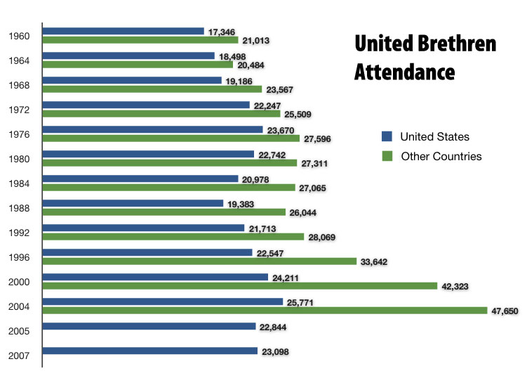
This chart shows the average attendance in United Brethren churches since 1960. In the United States (the blue lines), we climbed to a high point in the mid-1970s, fell to a low point in the mid-1980s, then gradually grew back to a new high in 2004. What does it all mean?
The sharp decline after 2004 no doubt relates to our efforts to join the Missionary Church, and the aftermath (when a number of churches withdrew). But it looks like we have stopped the hemorrhage, and are growing again (albeit with a smaller number of churches).
Notice the green line, too–the worldwide attendance. Although the United States attendance hasn’t grown very much, the overseas work has done well. And most of our overseas churches are an outgrowth of the US churches.
The ups and downs in charts like this are open to lots of interpretation. Factors such as leadership, emphases, generational changes, and demographics can all play a role. We welcome your own interpretations. Leave a comment.
Pastor Adam Will
Posted at 10:48h, 24 NovemberA few observations:
1. Overseas, God is doing a great work.
2. Are we turning the curve? Or are we just moving up and down?
3. It really disappoints me that we have grown by only 6,000 since 1960. We need to get on task. The fields are white unto harvest!