21 Feb HU Students Revisit Orphanage in India

The January 2013 Huntington University group at India’s Taj Mahal.
The trip ended weeks ago, but the smell of chai and the busy sounds of students still fill the Alexanders’ living room every week as they recount their J-Term trip to India.
It was the second year in a row that Huntington University students made the trek to Chennai, India, to serve in an all-girls orphanage.
“The trip revealed to me how blind I have been to a number of spiritual and emotional realities,” said Dr. David Alexander, assistant professor of philosophy, the trip leader. This was his first-time visit to India.
From January 4-21, Alexander and his family joined14 HU students in traveling to Channai, where they led a Vacation Bible School program for the girls with drama, games, music, dance, and crafts. The team also began building a new dormitory for the girls while they were in school.
“It was like I had never left,” said Genevieve Alexander, who went on the trip last year and was the student leader this year. “When I stepped foot onto the grounds of the Home of Love, I heard my name called out, ‘Sister Gen!’ There couldn’t have been a better greeting than to hear their voices call out my name.”
The 2013 team followed in the footsteps of 15 HU students who ministered in Chennai the year before. The 2012 team held a Vacation Bible School, painted a mural, and created promotional videos for the orphanage. While they made an amazing impact on the orphanage, they did not realize the extent of how they were touched personally by the experience until they returned home.
Back in the U.S., a plan was formed to raise $20,000 to build a dormitory for the 70 girls. By December 2012, the team learned that they had reached and exceeded their goal. When the 2013 team landed, ground was broken on the new dormitory. Plans are already in place to continue trips in the future.
“One of the interesting things I learned from the [Home of Love] director is that it cannot survive without trips like the one we went on,” David Alexander said. He and his family plan to return to Chennai in January 2014 with the HU student team. “So they really need us to continue to go and show the world what they are doing.”
Collectively, the team described transformation and growth in their faith through their time spent with the girls at the Home of Love. All hope to return to India to continue building relationships with their global sisters and encourage others to share in the experience.
“The India trip changed my heart beyond my wildest dreams,” said sophomore Stephanie Yoder. “I really didn’t know what to expect, and I tried to start the trip without any expectations except for one — that the Lord would move our team and protect our team. Ultimately, he did much more than that. Not only did He guide and protect us and bless us with his mercies, but he brought us closer together as a team, to the Home of Love girls, and to him.”

 Beth Palmer, daughter of Rev. Charles Malson, Sr. (right, with wife Doris), sent this update on her father’s condition on February 18: “Daddy is fairly well settled in on the third floor at the specialty section of St. Lawrence. He has been breathing on his own for over 24 hours, so they are considering removing the vent machine. He will continue to keep his trach for the next few weeks. He is able to swallow the liquid from small ice chips. Daddy sat in a recliner for a couple hours this morning but is sleeping now. He may do a little more therapy later today. Will be glad to have him better and closer to home. Please pray for a very quick recovery.”
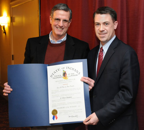
 Marvin Schwartz (right), pastor of New Horizons UB church (Rockford, Ohio) since 2008, reports that his father passed away on Sunday night, February 17, 2013. The funeral will be held on Wednesday, February 20, at 10:30, at the Berne Evangelical Church (Berne, Ind.). The viewing is Tuesday night, February 19, from 2-8 pm at the same location.
 Gonzalo Alas (right) emailed to say he is doing much better after the


 In the 1970s, we produced a denominational logo with three key elements–two linked figures, a cross, and a flame. The logo was refined by a professional design firm in 1979. They actually gave us three versions (right), and churches were free to use any of them. Probably not a great idea, as opposed to settling on a single logo which would be used consistently, but flexibility was desired and that’s what we did.
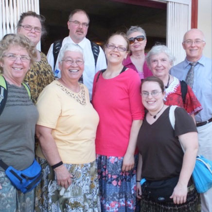
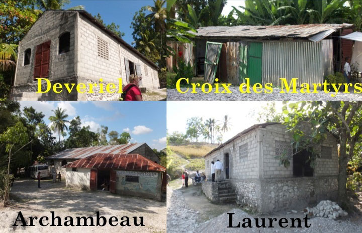
 The UB Church in Canada sent two teams, back to back, to Haiti in early 2013. The first team worked mostly on construction issues (
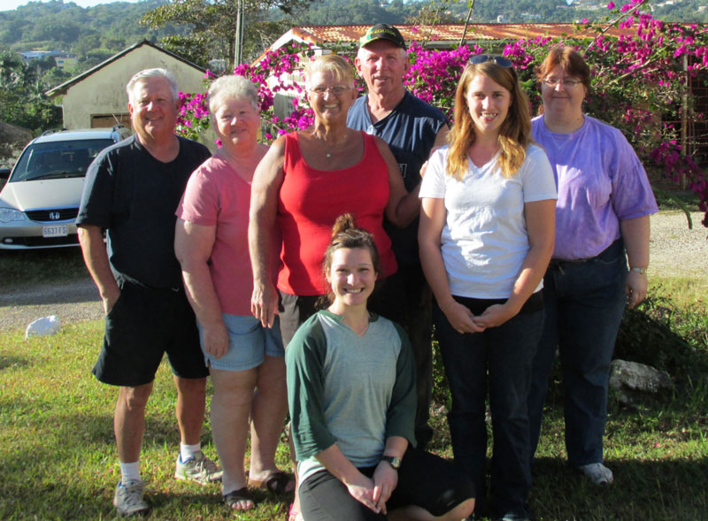

 Dwight and Patti Kuntz (right) are Global Ministries JumpStart staff serving in Jamaica. They filed this report on behalf of Regent College of the Caribbean. The school was formerly called Jamaica Bible College, but underwent a name change to appeal to a broader base of students throughout the Caribbean region.